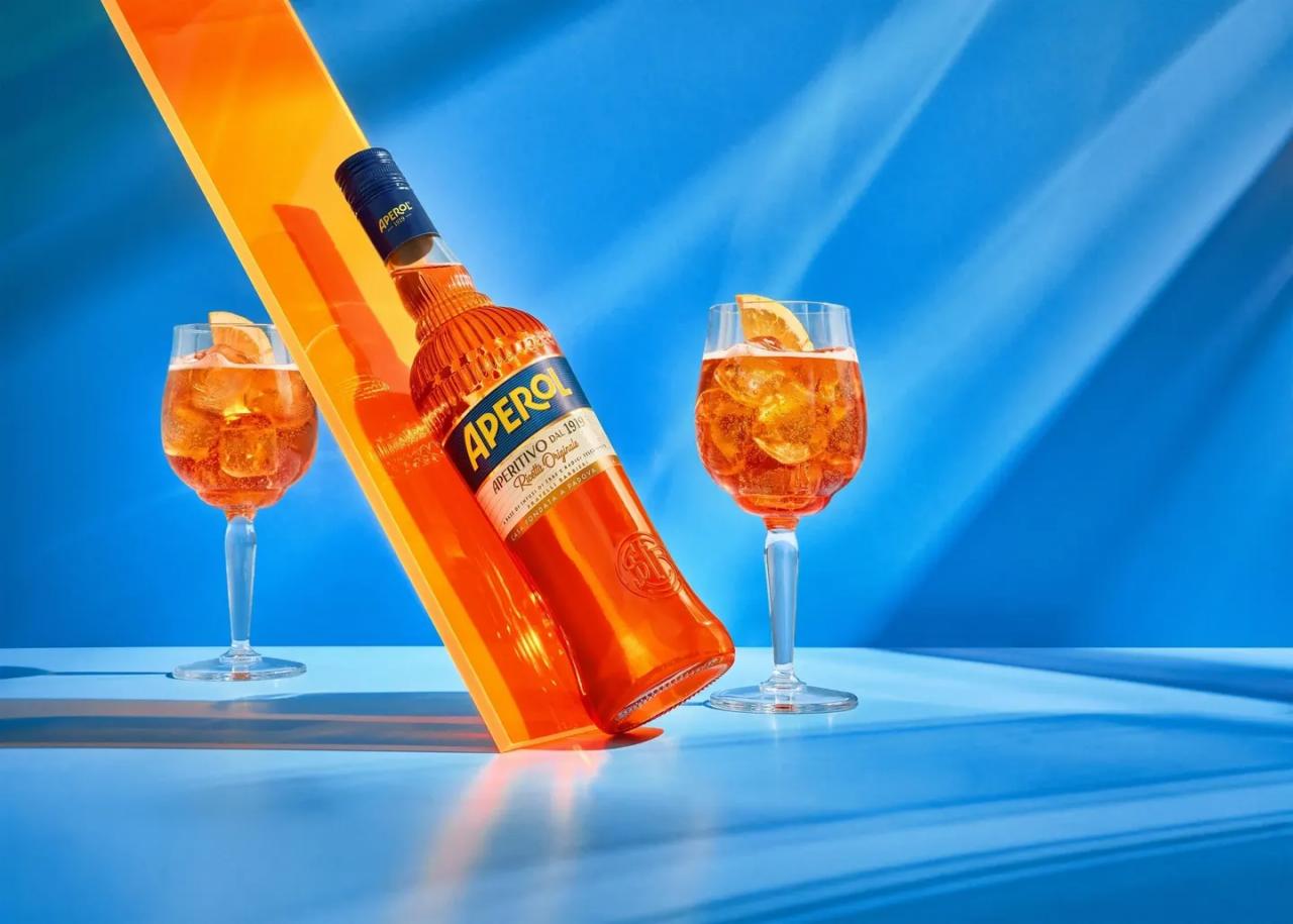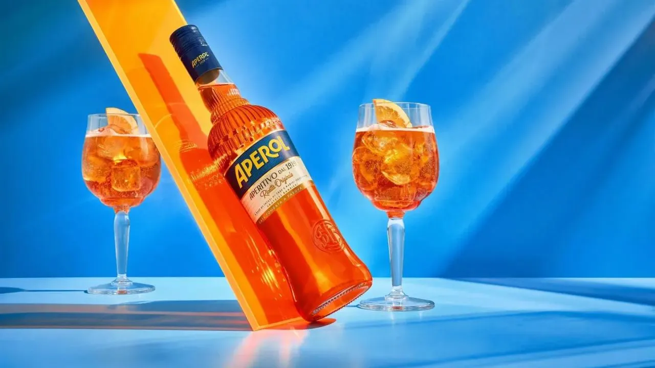
Icons don’t change often. And when they do, it’s usually a delicate process that strikes a balance between respect for history and the need to reflect the present. This is precisely the case with the Aperol brand, which is now unveiling a redesign of one of its most recognisable features: its iconic bottle.
Evolution, not revolution
The new bottle design does not represent a radical departure, but rather a thoughtful evolution. The brand is aware that its visual identity is deeply rooted in global bar culture, so the aim was to preserve the product’s DNA while moving towards a more contemporary look.
As the brand itself states, the redesign is intended to “reflect its Italian roots while offering a more modern interpretation of an icon enjoyed by people all over the world.”
One of the key themes of the redesign is an emphasis on Italian heritage. The bottle now appears cleaner, more confident, and more premium, without losing the playful and accessible identity that is inextricably linked with Aperol.
The typography is bolder and more legible, helping the brand communicate more effectively both at the bar and in retail. The overall shape of the bottle has been adjusted to appear more ergonomic and visually balanced—a feature that will be appreciated not only by consumers but also by bartenders in their daily work.
Aperol as a symbol of the modern aperitif
The redesign is no coincidence. Aperol is now synonymous with the aperitif cocktail category, primarily thanks to the Aperol Spritz phenomenon, which has become one of the world’s most popular drinks.
As consumption habits change—with an emphasis on lightness, sharing, and visual appeal—the product itself must evolve. The bottle is thus not merely packaging, but a key communication tool for the brand.
For professionals in gastronomy and mixology, the redesign has clear significance. The product’s visual identity is now an integral part of the guest experience. A bottle sitting on the bar is not just a functional object, but also an aesthetic element that helps shape the atmosphere.
The more modern design helps Aperol remain relevant in an environment where visual storytelling is increasingly prevalent—whether in high-end bars or in casual settings. The bottle redesign serves as a reminder that even the strongest brands must respond to change—not abruptly, however, but with respect for their own history.
With this move, Aperol confirms its position not only as a product but as a cultural phenomenon: a symbol of the Italian way of life that can adapt to a new generation of guests without losing its authenticity.